Tired of ugly book covers.
I had a very tough time learning book cover design. I read a lot about it, but it was so much “blah blah blah” that I just got sick of it and decided to learn on my own. I ended up spending two years obsessing over popular book covers - which caused me to notice that there was, in fact, a pattern. That realization led me to sell over 25,000 books on Amazon and eventually creating a system of layout templates for the front, back, and spine designs to help other people who were just as frustrated and confused as I was.
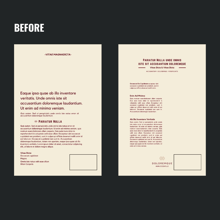
So here’s the one the thing that LITERALLY no one will tell you about book cover design — it's about your text layout — Of course, it helps if you use proper contrast and a background that isn’t poorly photo-shopped. At the end of the day, you can make a book cover “look like a real book” if you focus on book cover typography layouts before anything else. This includes the back cover and spine too.
Feel free to reach out for any other questions. No question is too simple or too complicated when it comes to book cover design!